

For decades now, businesses have been using websites to interact with customers. From providing information about services offered to answering common customer questions, websites play an essential role in the customer journey.
While launching a website is the first step in ensuring that your business is represented online, the quality of your website also plays a critical role in the success of converting leads. Over the years, customer expectations around websites have grown. Gone are the days when a static HTML website was enough to cut it.
Today, customers expect to land on a website that not only provides information but is easy to interact with and simple to navigate. In this guide, we’ll talk about why your website navigation is important, what styles you can use, and how you can improve your overall website flow. This can help ensure customers are led to the right place when they visit you online.
Why Your Website Navigation Matters
Similar to navigating a roadway, a website contains multiple routes that a visitor can take. Depending on how a visitor lands on your website — for example, did they arrive on your homepage from a Google search results link or on a landing page from an ad — they may wish to navigate away from where they landed to an alternative page on your website.
This is where navigation plays a critical role. For example, if you have an auto repair shop and a customer lands on your home page, they might want to know more information about the pricing of an oil change. They might look for an option in your website menu to learn more about oil changes, or they might want to reach out via phone to talk to a mechanic at your shop. How they navigate from the first page they landed on to your service pricing page or your contact page is important. If they cannot find the information they want quickly, they may leave your website.
Website navigation can mean the difference between converting a lead and losing a lead. It is imperative that you take the time to understand the workflow of your website and where you might be losing customers.
Understanding Your Website’s Navigation Structure
Websites can be structured with numerous navigation structure styles. Essentially, your navigation is based on hyperlinks that connect one page to another. In the case of your website navigation, you will be using internal hyperlinks, drawing a visitor from one internal web page to another.
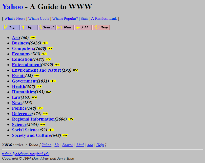
The navigation structure of your website describes the format in which you present your hyperlinks. For example, early iterations of websites often featured basic blocks of text. Within this text, words were hyperlinked. These could be clicked on to be led to the next page.
Take, for example, this screenshot of Yahoo’s website in the early ’90s.
Since the ’90s, website navigation has come a long way. Rather than simply hyperlinking text, websites now feature interactive menus containing visual elements, which make navigating a website easier.
Most websites feature either horizontal or sidebar navigation. In some cases, they use a combination of both, particularly for large websites with a vast number of internal pages. In the case of a service business, one navigation bar is usually adequate for displaying internal paths.
Whether you are investing in a redesign of your existing website or are building one from scratch, paying attention to how your navigation is set up is critical to ensuring that visitors find the information they seek.
Let’s take a look at six ways you can improve your navigation.
1. Use Heatmaps to Understand User Behavior
One of the first things you can do to better understand how well your existing website navigation is working is to set up a heatmap test. Services, such as Hotjar, will allow you to see a graphical representation of how your visitors interact with your website.
Using colors, a heatmap creates an easy-to-understand visual, which demonstrates what areas of a web page a visitor looks at, what buttons they click on, and how far they scroll down a page.
Heatmaps aggregate this data and turn it into something insightful, taking the guesswork out of understanding what elements of your website navigation are working well. By setting up heatmap tests on your website, you can quickly create a list of improvements.
For example, you might notice that no one ever scrolls to the bottom of your home page. This would let you know that storing important navigational links at the bottom of your page won’t be helpful for customers. You might also see through a heatmap that most customers immediately click on your services tab. This could help you understand the importance of providing a strong call to action (CTA) on your service page.
2. Implement Breadcrumb Navigation
Another helpful way to improve your website navigation is to make it easier for customers to backtrack on your website. This is particularly important if you have a large number of internal web pages.
One method for visualizing the path a customer has taken is through the use of breadcrumb navigation. Breadcrumb navigation is named after the tale of Hansel and Gretel walking through the forest. Dropping breadcrumbs along the way, their goal was to be able to retrace their steps back by following the breadcrumbs.
In a similar manner, breadcrumb navigation uses a visual element to show visitors the path they took to land on an internal page. For example, if a customer started on your website home page, then clicked on a service page, then clicked on an AC installation page, then clicked on an AC units for sale page, they might want to go back to re-read something from the service page but might not know how to get back.
Through the use of a breadcrumb navigation tool, you could add a small visual to the top of each page that indicates their journey and offers hyperlinks back to any step they took. In this case it might read: Home > Services > AC Installation > AC Units for Sale. By clicking on any of these page names, they could quickly go back to an earlier page.
3. Optimize for Mobile
Mobile internet traffic now accounts for nearly 55% of total web traffic. For this reason, it is safe to assume that at least half of your visitors will be landing on your website via a mobile device.
To ensure your mobile visitors can still navigate your website, make sure you specifically optimize menus and navigational devices for mobile. This is one of the most common mistakes that small businesses make. Their website looks and behaves well on a laptop or desktop but is difficult to navigate on a mobile device. Often, menus will look completely different on a small screen than they do on a large screen. This can make it impossible for customers to find the information they seek.
Make sure to test all menus on mobile screens. Your menus should move around automatically to offer the easiest navigation based on the device utilized.
If you want to quickly test your website across numerous devices, use BrowserStack. This handy tool offers you the ability to see how your website looks on dozens of devices at once.
4. Aim for Consistency
When a visitor moves from page to page throughout your website, your goal should be to ensure a consistent experience. Nothing is worse than having menus change from page to page, which can lead to confusion for the user.
Today, most websites are designed with a global website navigation bar. This menu remains identical across every website page. Often, these menus are also designed to follow a user as they scroll down the page, similar to freezing a row or column on an Excel spreadsheet.
By creating a global navigation bar, you can make it easier for visitors to always be able to find their way back to another page.
5. Avoid Cumbersome Dropdowns
Many horizontal — and some vertical — menus feature dropdowns. You scroll over or click on a menu tab and another list of web pages drops down. Going even further, in some cases, when you click on the next tab, another menu pops out to the right of the dropdown.
While dropdowns can be helpful in limited situations, be careful that you do not create unwieldy dropdowns featuring layer after layer of menus. This can be not only confusing for a visitor but can also lead to behavioral issues with the menu itself. If a screen is too small or a user doesn’t hover their mouse at just the right spot, the whole menu can collapse, creating a frustrating experience for customers. It can also make it difficult for a customer to remember how they wound up on a specific web page.
6. Add a Search Feature
While your goal is to create navigation that is easy for your visitors to use, one of the best ways to help your customers find exactly what they are looking for is to add a search feature to your website.
A search feature allows your customers to type a keyword or phrase into a search bar. This will then deliver them results from internal pages on your website. In some cases, you might also have an independent search bar on your blog, which allows readers to search for specific articles on your website.
If you do add a search feature, make sure you test it out to ensure that it is delivering quality results. The goal is to make it easy for customers to quickly find information about your products, services, or contact methods.
Contact J&L Marketing to Revamp Your Website Navigation
If you are interested in improving your current website navigation, our team is here to help. At J&L Marketing, we can assist you in understanding how your customers currently navigate your website and look for areas where you might be able to improve the experience. Improved website navigation can help you lead customers into taking a desired action, such as requesting a free quote or scheduling services.
To learn more, reach out to our team to set up a consultation. We will take the time to learn more about your business, your marketing goals, and your website. From here, we can design an all-encompassing marketing strategy that will focus on capturing more leads with less spend.